Skins
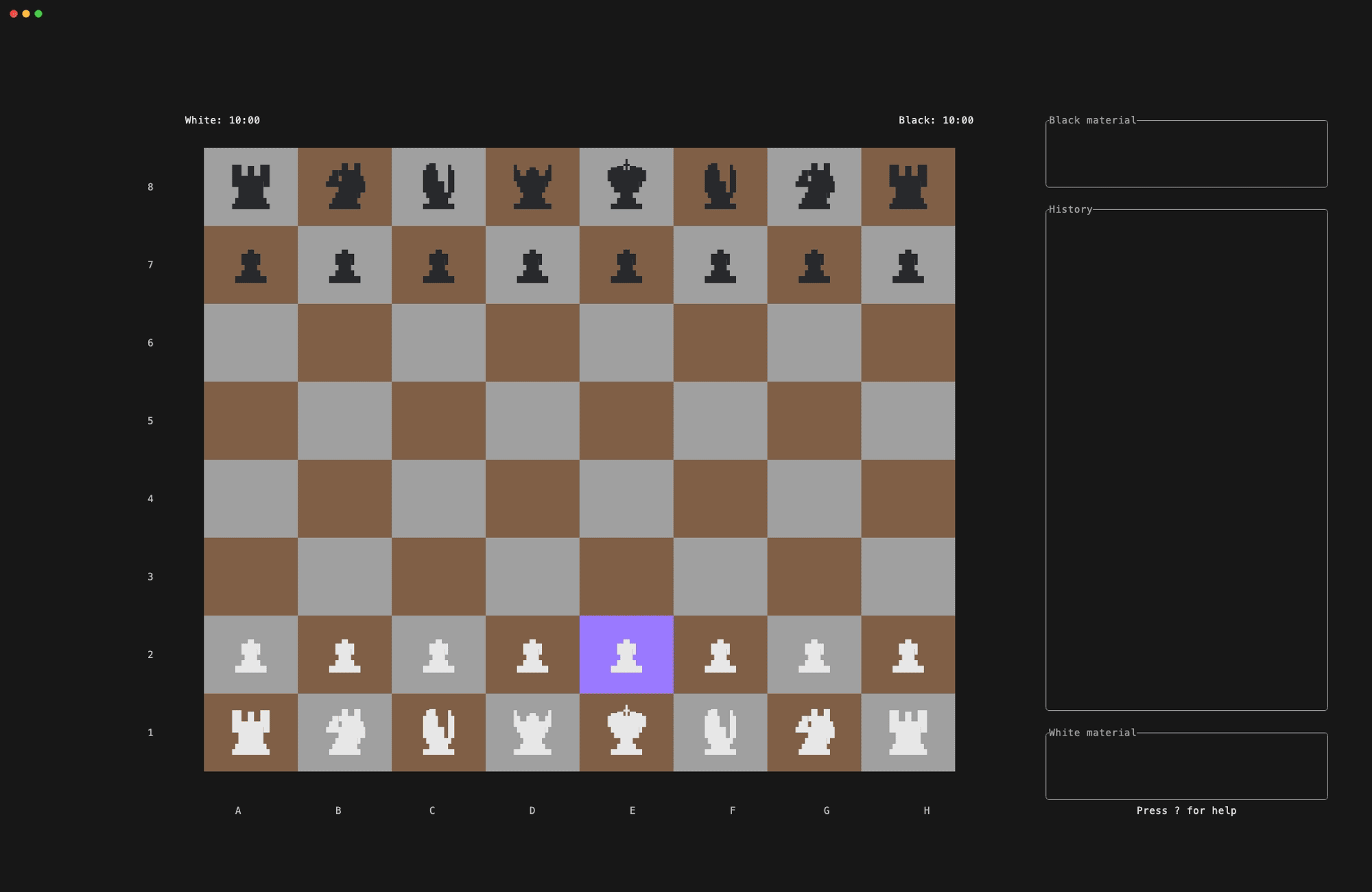
Chess-tui supports custom skins that let you change the look of the board and custom piece styles (the characters or art used for each piece). A skin combines a piece style with colors for the board, pieces, cursor, and highlights.
Updating the skin config from the app default
To replace your current skins.json with the built-in default (and archive your existing file):
chess-tui --update-skins
File Location
Skins and piece styles are configured in a single JSON file:
CONFIG_DIR/chess-tui/skins.json
CONFIG_DIR is typically:
- Linux:
$XDG_CONFIG_HOMEor$HOME/.config - macOS:
$HOME/Library/Application Support - Windows:
%APPDATA%(Roaming AppData folder)
The file contains two top-level arrays: piece_styles (how pieces look) and skins (which piece style + colors to use).
Using Skins
Cycling Through Skins
- From the Home Menu: Go to the "Skin" item and press Space or Enter to cycle, or Left / Right arrow (or h / l).
- During a game: Press s to cycle through skins at any time.
Built-in Options
- Default: Unicode chess pieces with built-in colors (no custom piece style needed).
- ASCII: Single letters (K, Q, R, B, N, P) for maximum terminal compatibility.
Any skin in skins.json can use a piece style by name (e.g. SIMPLE, MINIMAL, or your own). If the piece style name is not found, the UI will show a fallback message.
Skin Configuration Format
The config file has two main sections:
{
  "piece_styles": [ ... ],
  "skins": [ ... ]
}
Skins array
Each skin entry looks like this:
{
  "name": "Skin Name",
  "piece_style": "SIMPLE",
  "board_white_color": { "Rgb": [200, 220, 235] },
  "board_black_color": { "Rgb": [100, 140, 170] },
  "piece_white_color": { "Rgb": [255, 255, 255] },
  "piece_black_color": { "Rgb": [25, 55, 95] },
  "cursor_color": { "Rgb": [150, 200, 230] },
  "selection_color": { "Rgb": [120, 180, 220] },
  "last_move_color": { "Rgb": [100, 160, 200] }
}
| Field | Type | Description |
|---|---|---|
name | string | Name shown in the skin menu |
piece_style | string | Name of a piece style (see below). Use "DEFAULT" for Unicode pieces, "ASCII" for letters. |
board_white_color | color | Light square color |
board_black_color | color | Dark square color |
piece_white_color | color | White pieces color |
piece_black_color | color | Black pieces color |
cursor_color | color | Cursor highlight |
selection_color | color | Selected piece highlight |
last_move_color | color | Last move highlight |
You can use piece_style or the legacy key display_mode; both refer to the same setting.
Custom Piece Styles
Piece styles define the characters or art used for each piece (king, queen, rook, bishop, knight, pawn). The app picks one of four sizes from the cell height: small, compact, extended, large. You must define all four sizes and all six pieces for each size.
Piece style structure
{
  "name": "MY_STYLE",
  "small": {
    "bishop": "B",
    "king": "K",
    "knight": "N",
    "pawn": "P",
    "queen": "Q",
    "rook": "R"
  },
  "compact": {
    "bishop": " ▓ \n ░ \n   ",
    "king": " ▓ \n ▓ \n   ",
    "knight": " ▓ \n ▓ \n   ",
    "pawn": " ░ \n ░ \n   ",
    "queen": " ▓ \n░▓░\n   ",
    "rook": " ▓ \n ▓ \n ▓ "
  },
  "extended": { ... },
  "large": { ... }
}
name: Unique identifier. Skins reference this (e.g."piece_style": "MY_STYLE"). Do not use"Default"or"ASCII"for custom styles; those are reserved.small,compact,extended,large: One object per size. Each object has six keys:bishop,king,knight,pawn,queen,rook.- Values: Plain strings. Use
\nfor multiple lines. The app centers the block in the cell; keep lines similar in width for best alignment.
How sizes are chosen
Size is chosen from the cell height (in lines):
| Cell height | Size used |
|---|---|
| < 3 lines | small (single character) |
| 3 lines | compact (2–3 lines) |
| 4 lines | extended (3–4 lines) |
| 5+ lines | large (multi-line art) |
So for tiny boards you get small, for big boards you get large; the others are used for in-between sizes.
Tips for custom pieces
- Small: One character per piece (e.g.
K,Q,♚,•). Same character is used for both colors; the skin’spiece_white_colorandpiece_black_colorgive the difference. - Compact / extended / large: Use
\nfor newlines. Align lines to the same width (e.g. with spaces) so the block centers cleanly. - Unicode: You can use any Unicode character (e.g.
♔,▣,◆,●). Make sure your terminal and font support them. - Testing: Add one custom piece style and one skin that uses it; cycle to that skin in the app to verify. If you see “(STYLE_NAME) piece style not found”, the name in
piece_styledoesn’t match anypiece_styles[].name.
Example: minimal custom style
One-line pieces (small only; other sizes omitted for brevity—in real config you must define all four):
{
  "name": "DOTS",
  "small": {
    "bishop": "•",
    "king": "◎",
    "knight": "◉",
    "pawn": "·",
    "queen": "✦",
    "rook": "▪"
  },
  "compact": { "bishop": "•", "king": "◎", "knight": "◉", "pawn": "·", "queen": "✦", "rook": "▪" },
  "extended": { "bishop": "•", "king": "◎", "knight": "◉", "pawn": "·", "queen": "✦", "rook": "▪" },
  "large": { "bishop": "•", "king": "◎", "knight": "◉", "pawn": "·", "queen": "✦", "rook": "▪" }
}
Then a skin that uses it:
{
  "name": "Dots Board",
  "piece_style": "DOTS",
  "board_white_color": { "Rgb": [240, 240, 240] },
  "board_black_color": { "Rgb": [80, 80, 80] },
  "piece_white_color": "White",
  "piece_black_color": "Black",
  "cursor_color": "LightBlue",
  "selection_color": "LightGreen",
  "last_move_color": "LightGreen"
}
Color Formats
Named colors (string)
Use terminal color names, e.g. "White", "Black", "LightBlue", "LightGreen", "Red", "Gray", "DarkGray".
RGB (object)
"board_white_color": { "Rgb": [240, 217, 181] }
Each component is 0–255.
You will be asked to confirm. If you confirm, the current file is saved as skins_YYYY-MM-DD_HH-MM-SS.json in the same folder, and skins.json is overwritten with the default content. Use this to get a fresh piece_styles + skins template or to recover after a bad edit.
Tips for Creating Skins
- Contrast: Use clearly different colors for board squares and pieces so pieces stay readable.
- Piece vs board: Avoid piece colors that are too close to
board_white_colororboard_black_color; otherwise pieces disappear on some squares. - Cursor and highlights: Choose cursor and selection colors that stand out on both light and dark squares.
- Custom piece styles: Ensure every skin’s
piece_stylematches anameinpiece_styles, and that each piece style defines all four sizes and all six pieces.
Default skins and piece styles
The built-in default config includes:
Piece styles
- DEFAULT: The default piece style of chess-tui, hardcoded in the program itself
- ASCII: The ASCII piece style of chess-tui, hardcoded in the program itself
- SIMPLE: Single letters per size (s/c/e/l style).
- MINIMAL: Symbolic/geometric shapes (e.g. blocks and simple Unicode symbols).
Skins (examples)
- Default, Classic: Traditional board and Unicode pieces.
- Matrix, Neon, Midnight: Dark themes.
- Ocean, Forest, Sunset, Retro: Themed colors; some use MINIMAL piece style.
You can add your own piece_styles and skins to skins.json; the app loads both and shows all skins in the skin menu.